
Exploring Data Analysis with ChatGPT's Code Interpreter: Is Prompt Engineering Dead?
Buckle up--things are about to get even bumpier on the GenAI Train.

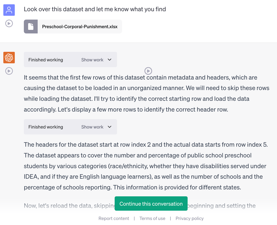
I got access a few days ago to ChatGPT’s Code Interpreter, and to say the least, it surprised me with how much better it was than even GPT-4, which itself surprised me when it was first made available by OpenAI in March. One novel use case it’s particularly good at is interpreting files that a user can upload—I’ll document in this post my experiences so far with uploading datasets for it to analyze, building on and improving the prompt that Ethan Mollick posted on LinkedIn yesterday.
Before I started, I read Dr. Mollick’s guide on Getting Started with Code Interpreter, and you should too. Like Dr. Mollick, I find that interacting with these LLMs is getting easier and easier. It’s very easy to just start talking to an AI about your data and get it to start prompting you for what you want, rather than the other way around. Over the past several months I’ve immersed myself in effective prompt engineering techniques, and this is why Code Interpreter surprised me so much. It’s so much easier now to get what I want from the AI, and providing it with an effective prompt isn’t nearly as difficult as it used to be. This makes the barrier for entry much lower; you can interact effectively with these models even if you don’t know exactly what you want or what you are doing. But—for now, at least—I don’t think prompt engineering is completely dead.
As Dr. Mollick notes in his blog post, with a powerful plugin like Code Interpreter, you can often get started with very simple prompts:
Even so, I’ve still found it helpful to tell the AI what I’m looking for, if I do in fact know what I’m looking for. This can help prevent it from things like hallucinating, making errors, and getting stuck in loops, all of which I’ve noticed it doing in the past few days. By the way, a pro-tip: before you proceed with your conversation, tell it to improve whatever prompt you had in mind to start the conversation. This is how my draft prompt (most updated version at the end of this post!) started. It seems GPT-4 was less interested than I was about impressing a hypothetical boss and seemed to be more interested in the intrinsic value of simply producing good work:
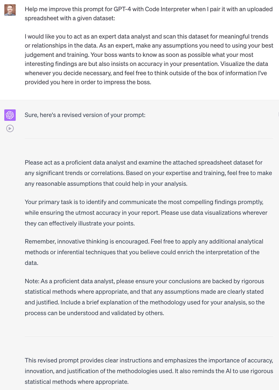
Dr. Mollick has been discussing similar findings with Code Interpreter and yesterday posted a first-draft prompt to get it to generate effective figures and charts. I’d like to build on Dr. Mollick’s prompt by combining it with the prompt I have been developing with Code Interpreter over the past few days (the first versions of which you can see above). This prompt orients ChatGPT with Code Interpreter to the task of taking a given dataset from the user as input and effectively analyzing it and helping the user understand and visualize the data:
As GPT-4 with Code Interpreter, acting as a proficient data analyst, examine the provided dataset for any significant trends or correlations. Based on your expertise and training, make any reasonable assumptions that could aid in your analysis, ensuring to clearly state and justify these assumptions so that they can be understood and validated by others.
To start, list some of the chart types that you can create, and describe the different output formats available.
Then, bear in mind the data visualization best practices suggested by Angela Zoss:
Do's:
1. Use the full axis to avoid distortion. For bar charts, the numerical axis must start at zero. If your data has wide ranges or inconsistent intervals, consider using multiple charts or ensure that you have a data point for every date at a consistent interval.
2. Simplify less important information. This can involve minimizing the use of chart elements like gridlines, axis labels, and colors.
3. Be creative with legends and labels. For example, you can label lines individually or put value labels on bars.
4. Ensure your visualizations pass the squint test. When the details are blurred, the main points of the visualization should still be clear.
Don'ts:
1. Avoid using 3D or blow apart effects as they can reduce comprehension.
2. Limit the use of colors to around six to make the visualization easier to understand.
3. Keep the style consistent throughout the visualization to facilitate comparison.
4. Avoid making users do "visual math." If a relationship between variables is hard to understand, consider doing additional calculations and visualizing that instead.
5. Don't overload the chart with too much information. If necessary, change chart types, remove or split up data points, simplify colors or positions, etc.
Your primary task is to identify and communicate the most compelling findings promptly, while ensuring the utmost accuracy. Innovative thinking is encouraged. Apply any additional analytical methods or inferential techniques that you believe could enrich the interpretation of the data.
As a proficient data analyst, ensure your conclusions are backed by rigorous statistical methods where appropriate. Include a brief explanation of the methodology used for your analysis, so the process can be understood and validated by others.
Once you've finished your analysis, ask if there are any specific data visualization needs or if there is more data to upload for further visualization.
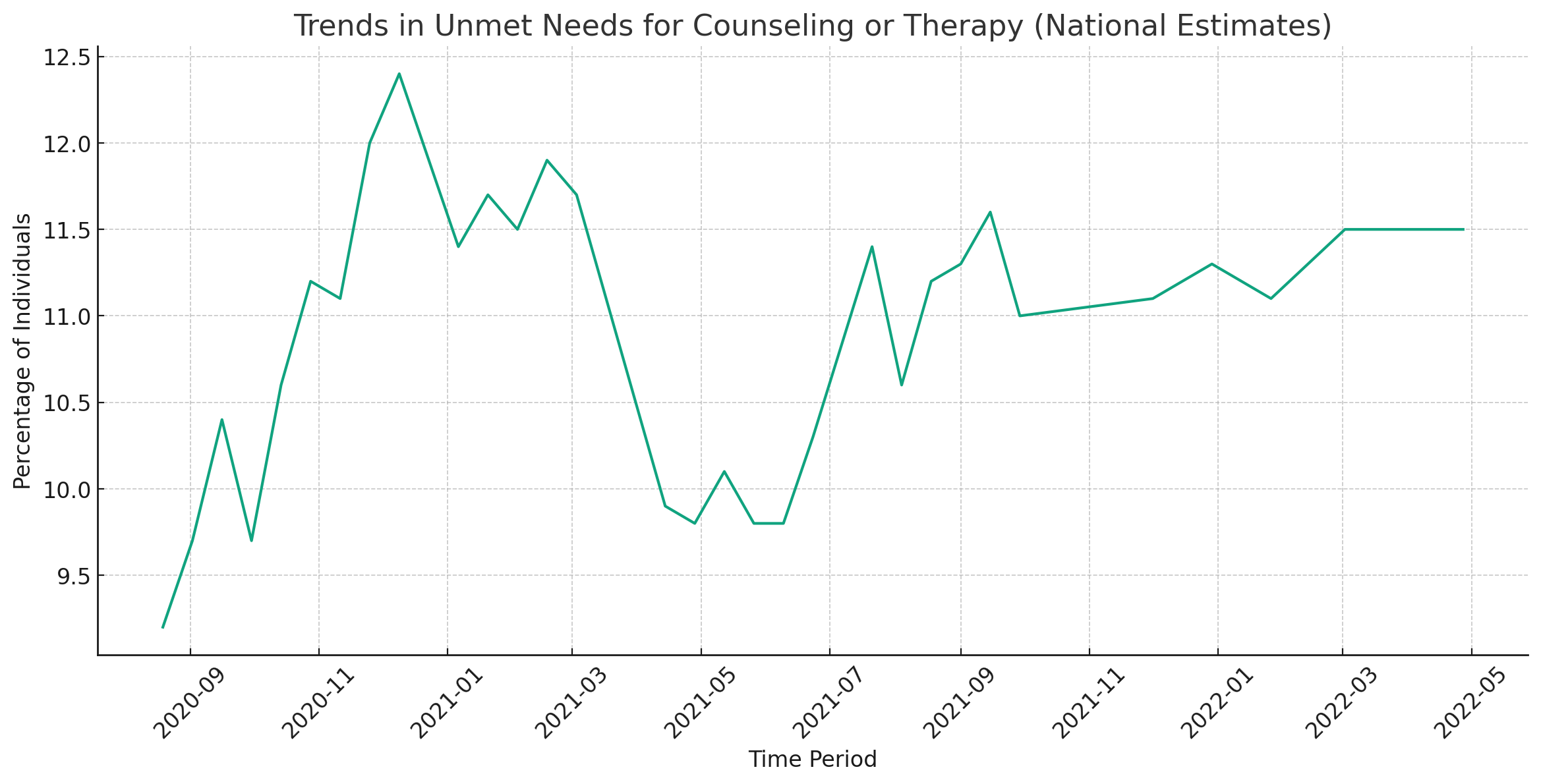
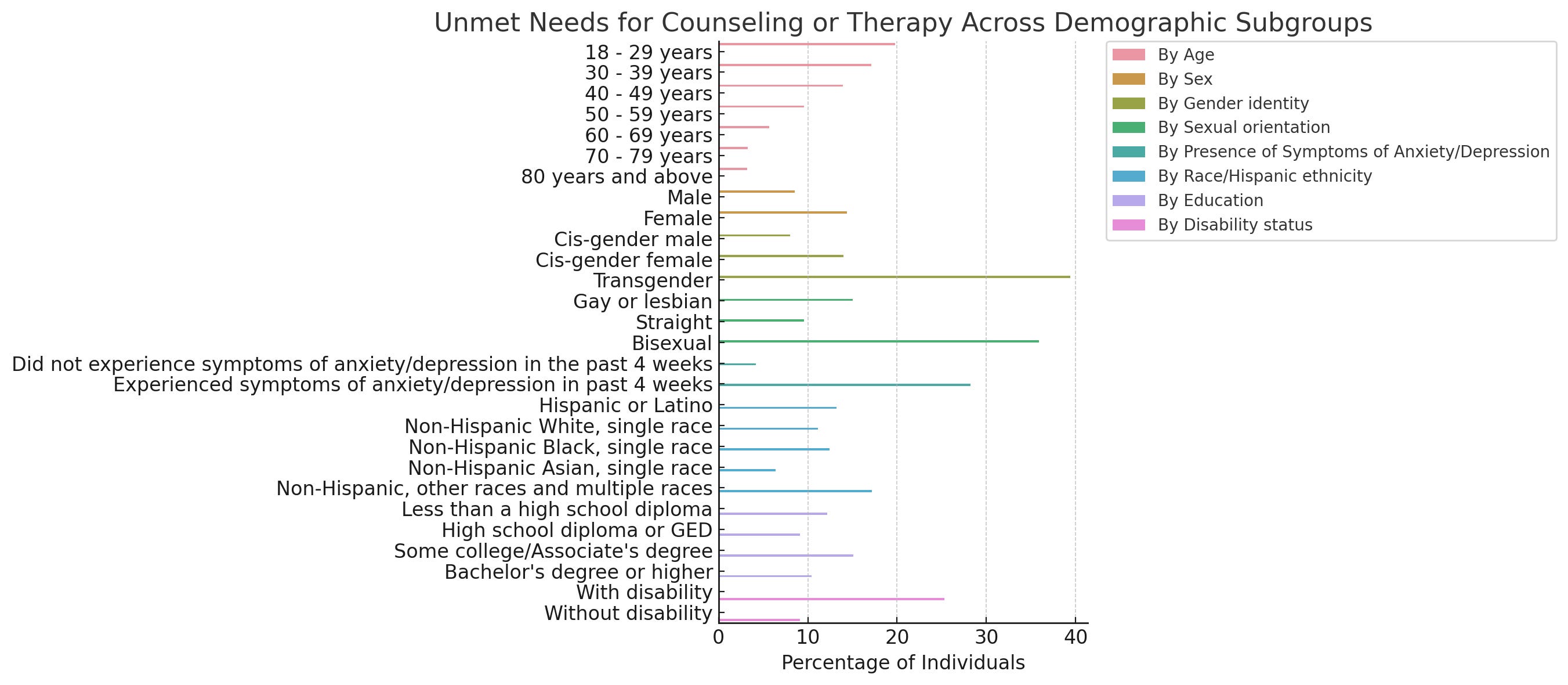
Feel free to suggest further improvements to the prompt! Here’s the link to a conversation I had with Code Interpreter today using this prompt to analyze a publicly-available dataset on “Mental Health Care in the Last 4 Weeks” (2020-2022). I have been testing out various prompts with this same dataset over the past couple days (including with my initial draft prompt and also with the simple prompt, “let me know what you find in this dataset”). Without any prompt, I was able to get results I was looking for, but it took longer to get things like good-looking graphs and charts that didn’t have crowded text or bar charts that were too small for humans to make any sense of. Here’s an example of some boxplots that took me a while to get right. The first iteration had 6 different boxplots crammed into one and it was impossible to read and I had to prompt it to break them up. It probably still isn’t perfect, but still—pretty cool that I didn’t have to go through the motions of making these manually:
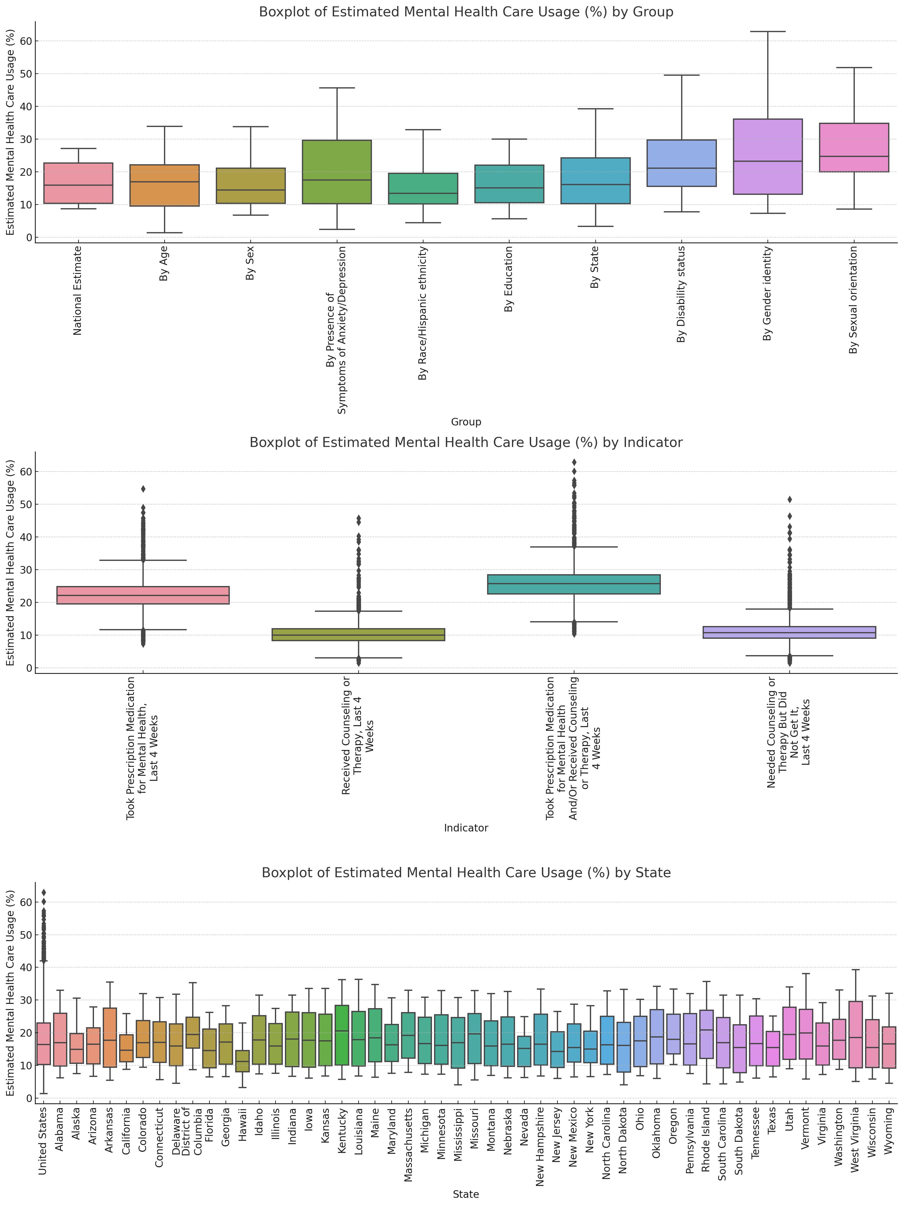
With the prompt highlighted above, I almost immediately got appealing visualizations without prompting it to fix issues with the graphs and charts.
This conversation is an example of how you can use this prompt for ChatGPT with Code Interpreter to effectively analyze a dataset, generate an APA-style writeup of the methodology and results, and even share your findings in an AI-generated social media post. It’s also an example of how the Human-in-the-Loop method is becoming more and more real. Which, by the way, worries me—but we’ll save that for another post.
Now, as always—a caveat. Is this use case of GenAI ethical and responsible? I don’t know yet. I definitely know that I won’t be using this with any institutional data, and neither should you (although that probably can go without saying for anyone who has been through IRB training)—for the purposes of this post I used only publicly-available data. As for using GenAI tools to generate words and images we will be putting our names on? Those are definitely conversations we need to continue having. Because these models are still developing, there are still a lot of uncertainties. As we interact with these GenAI tools, we need to independently verify everything they output, and we still need to take complete ownership of everything we put our names on. The leaps being made right now can seem exciting, but as with all new technologies, we need to be thoroughly cautious and overly critical.